ASO Sport Rebranding
I was approached by Oxigenesis to create a new brand language for the sport supplement company. The initial scope of work was to design one new label for the sport supplement, using the original bottle and logo.
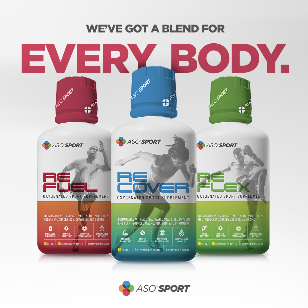
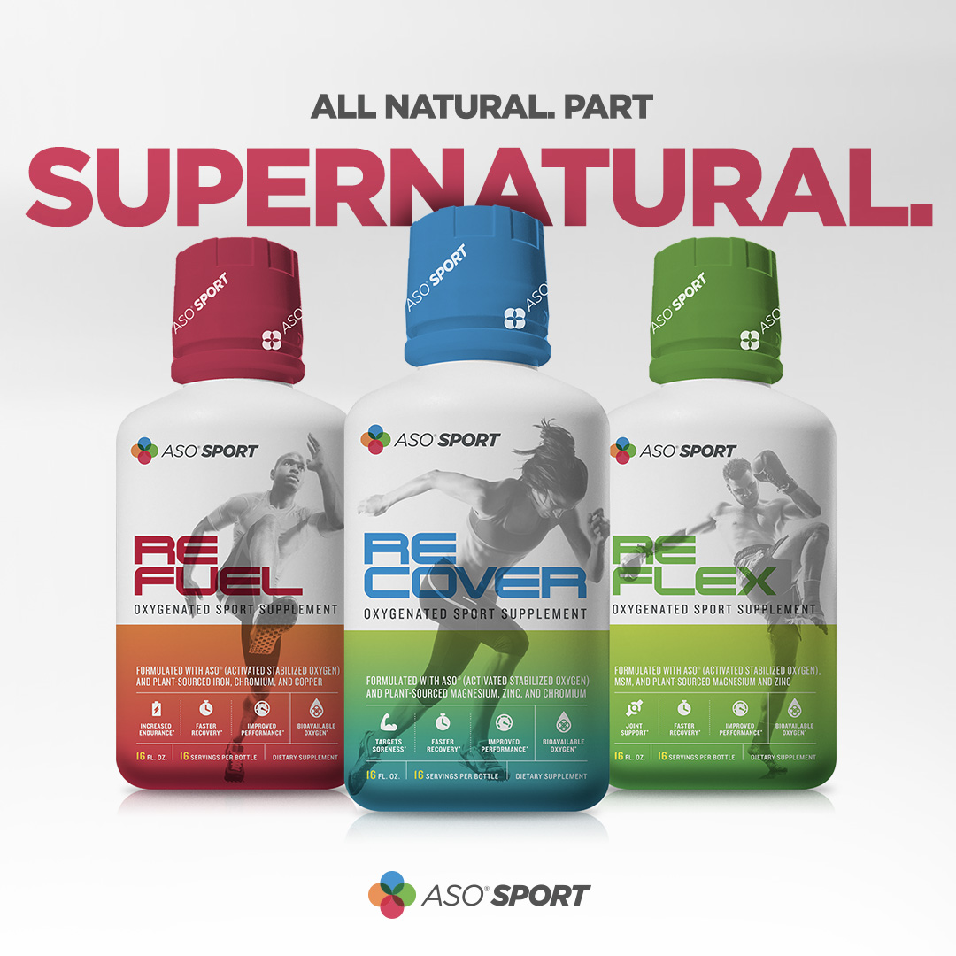
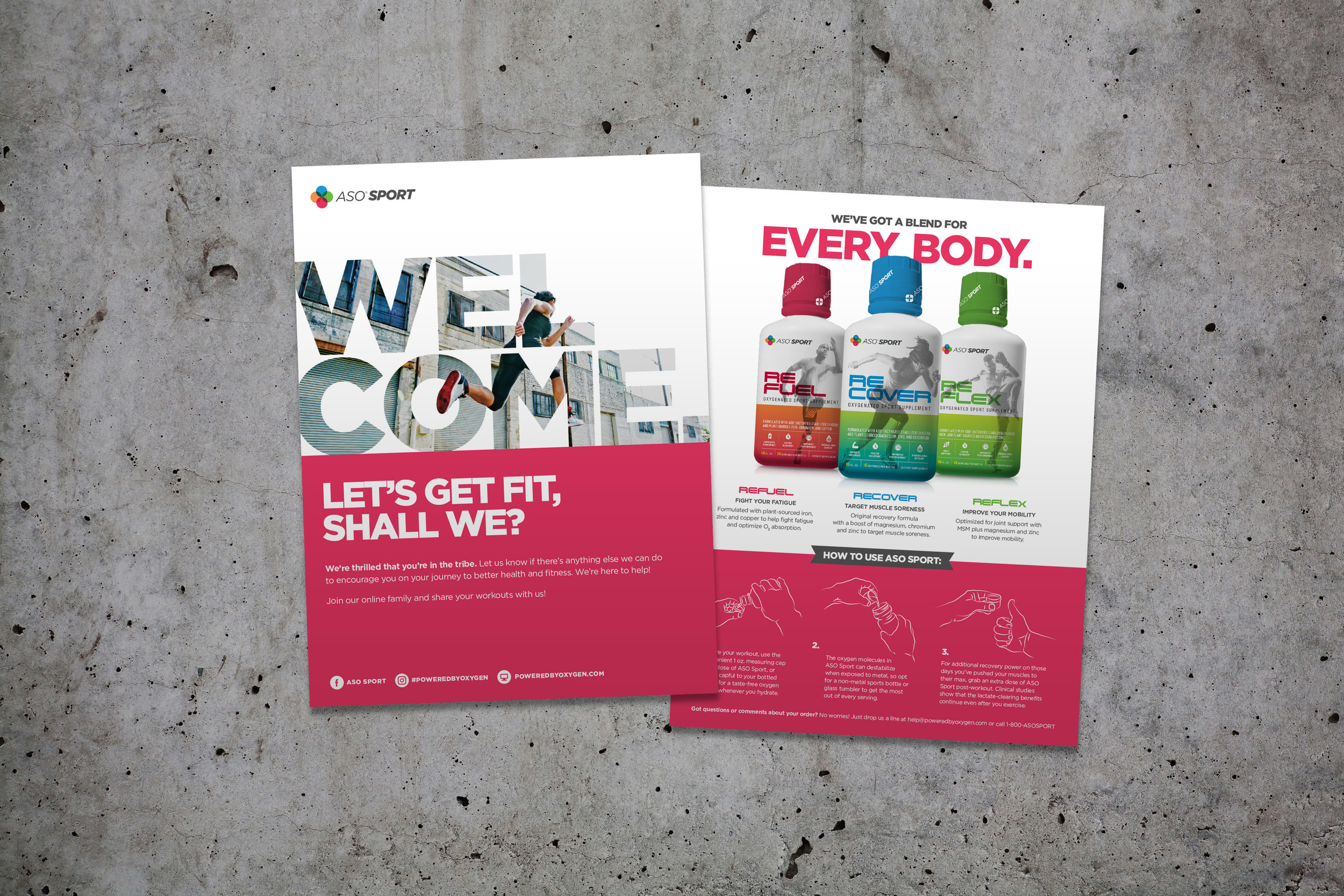
After discussing some brand strategy with our client, though, it became clear that there was a huge opportunity to create distinct series that targeted specific areas of physical recovery. From that, the ASO Sport line was born. I worked with the client to develop a nomenclature that spoke to the lactate-regenerative nature of the product and arrived at RECOVER, REFUEL, and REFLEX.


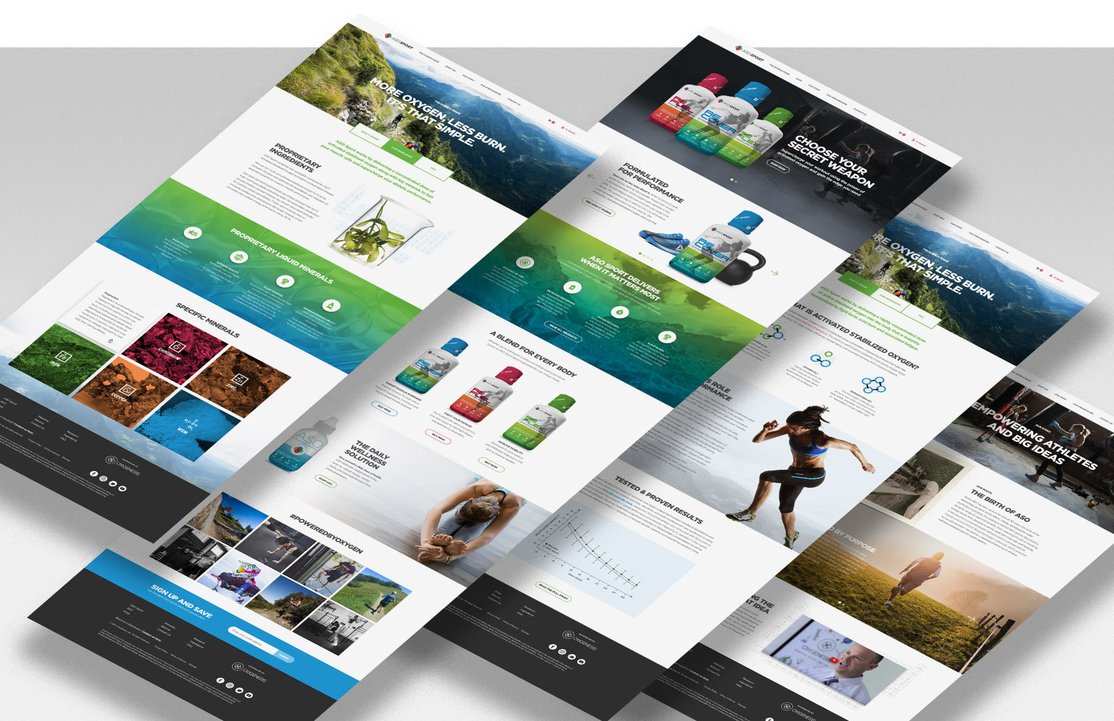
A fresh, new website was designed from the ground up with new photography, copy and content development that better educated customers about the science behind the supplement and the key benefits to athletes. This mobile-friendly site is built with secure e-commerce functionality.
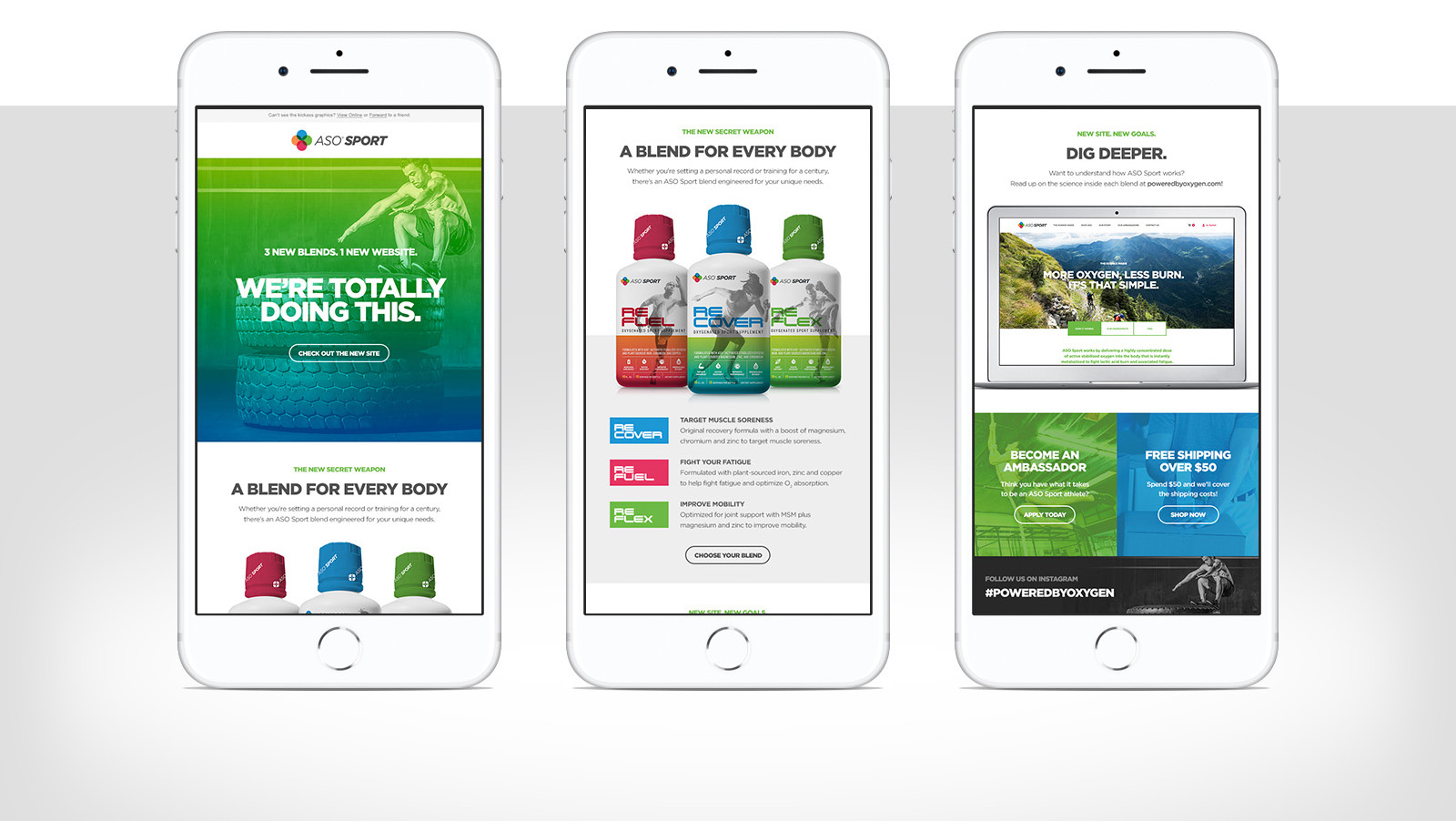
Hinging off the website look and feel, I created email templates that would drive customers to the new site and give them a glimpse into the new blend offerings.
This postcard is included with every shipment to new customers to instruct on basic product usage.
A custom water bottle was designed for use with the supplement.

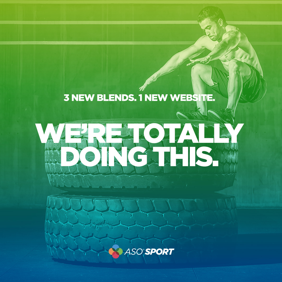
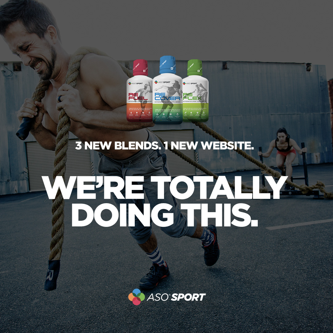
Finally, a series of Instagram posts were created, leveraging the new look and feel.